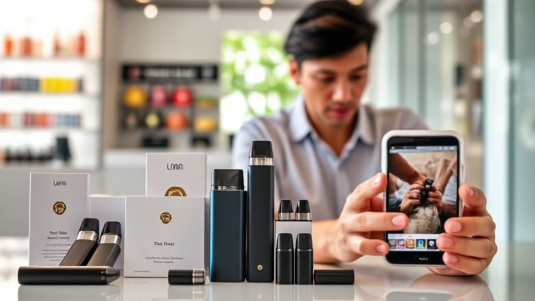
Reading a Vape Storefront Like a Designer: Sg Vape Disposable Usability Review
A storefront’s layout tells you more about a supplier than its tagline does. When you land on a page selling Sg vape disposable products, the first thing you notice should not be the banner — it should be whether the site makes it easy to find puff counts, flavour names and delivery terms. This review looks at vape supplier storefronts through a designer’s lens, focusing on how visual hierarchy, product-page structure and checkout flow shape buyer confidence and reduce ordering mistakes.
The goal here is not to rank brands. It is to explain why some interfaces feel trustworthy within seconds while others leave you second-guessing what you just added to a cart.
Why interface design is the first trust signal
Before a buyer reads a single product description, the layout has already answered three silent questions: Is this store organised? Does it look maintained? Can I find what I need without hunting? For a vape supplier singapore shoppers rely on, those answers matter more than any slogan, because disposable vapes are a repeat-purchase category where small frustrations compound quickly.
Designers call this perceived usability — the user’s snap judgment about how hard a task will be. A clean grid, consistent product cards and visible pricing all lower that perceived effort. Cluttered banners, pop-ups and mismatched fonts raise it. The interface is not decoration; it is the supplier’s handshake.
There is also an error-rate angle. When product names are ambiguous or images are reused across variants, buyers pick the wrong flavour or puff count. Good design prevents that mistake before it happens, which is cheaper than fixing it after delivery.
Product pages: where clarity beats decoration
The product page is the workhorse of any disposable vape storefront. A well-built page answers the buyer’s real questions in order: what is it, how many puffs, what flavour, what does it cost, and how fast can it arrive. Pages that lead with lifestyle photography instead of specs force the buyer to scroll and guess.
Information hierarchy that works
Strong product pages put the device name and puff count in the first screenful, with flavour variants clearly separated rather than buried in a dropdown. Images should show the actual device and packaging, not a generic render. When a store lists products like Lana Bar 5000 Puffs or Lana Blend 5000 Puffs, the puff count belongs in the title, not only in a spec table.
- Product name and puff count visible without scrolling
- Flavour variants listed as distinct options, not hidden text
- Price and availability shown next to the add-to-cart button
- Delivery estimate repeated near the purchase action
Common product-page mistakes
The most frequent error is inconsistent naming across the catalogue — one page says “5000 puffs,” another says “5K,” a third omits it entirely. That inconsistency makes comparison harder and signals a store that may not be carefully maintained. A close second is missing stock status, which leaves buyers guessing whether an item will ship today.
Checkout and delivery messaging: the confidence test
Checkout is where trust is either confirmed or lost. A short, linear checkout with visible progress indicators reduces abandonment. For disposable vape orders, the critical addition is delivery messaging: buyers want to know when the item arrives and how discreetly it is packaged. A store that surfaces SG Vape same day delivery terms before the payment step removes the biggest source of hesitation. vape supplier singapore
Designers should treat delivery copy as part of the interface, not fine print. If same-day cut-off times exist, they belong near the cart summary. If packaging is discreet, say so in plain language at checkout. Vague promises like “fast shipping” do less work than a specific line about Singapore vape delivery windows.
Reducing checkout errors
Error rates spike when forms are long, fields are unlabelled, or the order summary disappears on mobile. A good pattern is a persistent summary panel showing item, quantity and total alongside the address form. Inline validation — telling the user immediately if a postal code is malformed — prevents the frustrating loop of submitting and failing.
Another underrated detail is confirmation clarity. After payment, the screen should repeat the order contents and the expected delivery window. That single screen does more for repeat business than any discount banner.
Mobile layout and the thumb-zone problem
Most disposable vape browsing happens on a phone, often one-handed. That physical reality should shape the layout. Primary actions — add to cart, select flavour, proceed to checkout — belong in the lower half of the screen where the thumb reaches comfortably. Designers call this the thumb zone, and ignoring it is one of the most common mobile usability failures in e-commerce.
On mobile, sticky headers that eat a third of the screen are a liability. So are carousels that auto-advance before the user can read them. A better approach is a single-column product grid with large tap targets and a persistent cart icon. If a store offers sg vape delivery, the mobile header should make that promise visible without requiring a scroll.
What mobile buyers actually need
Mobile users need three things fast: search that works with partial product names, filters that persist when they go back, and a checkout that does not require pinch-zooming. When a store sells recognisable lines such as sg vape lana products, a search bar that tolerates spelling variations prevents dead ends.
Testing on a mid-range phone rather than a flagship device is a practical habit. Layouts that feel spacious on a large screen can collapse into overlapping elements on smaller ones, and that is exactly where order errors creep in.
A closing critique: design as a promise
Reading storefronts as a designer leads to a simple conclusion: the best vape supplier interfaces are boring in the right ways. They use consistent grids, repeat the same product naming conventions, show delivery terms early and keep checkout short. The worst ones are visually busy but information-poor, forcing buyers to work for basic answers.
For anyone comparing options, the practical test is to try a single order and watch where friction appears. Does the product page answer your questions? Does checkout confirm what you selected? Does the delivery message match what actually happens? A store that handles lana vape delivery with clear timing and a clean confirmation screen is telling you something about how it operates. A store that hides those details is telling you something too.
The interface is the promise. Everything after checkout is just whether the promise was kept.