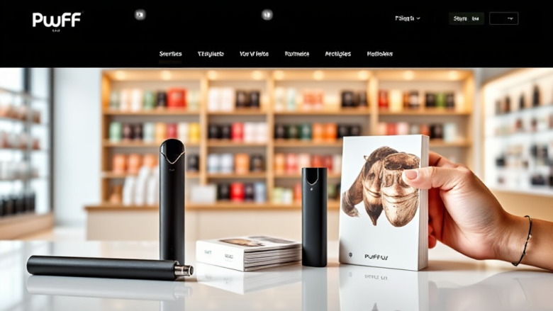
The Information Design of a Shisha Tobacco Category Page
The first screen of a shisha tobacco category page is a composition before it is a catalogue. A grid of pouches, a filter rail, a headline, a price line: each element competes for the same half-second of attention. When the page is built around Dark Side shisha, the composition has a specific job — it must let a shopper who already knows the brand scan strength, flavour family and pack format without reading every label. The question worth asking is not “does it look good?” but “what is this layout asking the eye to do first, and is that the right request?”
This is a design critique, not a buying guide. It looks at how a tobacco category page organises information, where the hierarchy helps, and where the visual grammar quietly works against the shopper.
The grid as the first argument
Most category pages open with a product grid, and the grid is the page’s strongest statement. In a Dark Side context, the pouches share a dark, high-contrast identity, so the grid reads as a wall of near-identical rectangles. That is a design problem before it is a merchandising one: when every tile has the same visual weight, the eye has no entry point and resorts to reading titles one by one.
Uniformity is the default, but differentiation is the job. A well-designed grid gives the eye a rhythm — a clear product image, a strength indicator, a flavour name — so scanning becomes vertical rather than random. When those three signals are aligned across every tile, the shopper can compare without opening a single product page.
What the tile needs to carry
A tobacco tile has to answer three questions at a glance: how strong is it, what does it taste like, and how much tobacco is in the pack. If the tile shows only a name and a price, the grid becomes a list of proper nouns that mean nothing to a newcomer and everything to a veteran — a split audience the layout should acknowledge rather than ignore.
- Strength or nicotine indication, placed consistently across tiles.
- Flavour family in plain language, not only a poetic product name.
- Pack weight and format, so quantity comparisons are possible.
Design note: consistency beats decoration. A small strength badge repeated in the same corner of every tile does more for scanning than any amount of background texture.
Filters, facets and the cost of choice
The filter rail is where category pages usually either earn their keep or collapse into clutter. For a brand-specific range, the useful facets are narrow: strength, flavour profile, pack size, and perhaps line or edition. Each additional facet adds a decision, and too many decisions push the shopper back to the grid rather than forward into a product.
Every filter is a question the page asks the shopper. If the page asks ten questions before the first click, the composition has shifted from browsing to form-filling. The strongest category pages keep the visible facets to the three or four that actually split the range, and hide the rest behind a “more filters” control.
Labels versus values
A related failure is facet labelling. “Strength” is clear; “Intensity” is ambiguous; “Boldness” is marketing. When labels drift into brand voice, the shopper has to decode the taxonomy before using it. Plain labels, ordered logically from light to strong, reduce the cognitive load and make the filter rail feel like a tool rather than a puzzle.
There is also a placement question. A left-hand rail is conventional and works on desktop, but on mobile the same facets must collapse into a drawer without hiding the active selections. If the shopper cannot see which filters are applied, they cannot trust the results — a small interface detail with a large effect on confidence.
Typography, contrast and the reading path
Dark packaging on a light background creates strong contrast, and contrast is the page’s main typographic asset. The risk is overuse: when every heading is bold, every badge is coloured and every price is emphasised, nothing is emphasised. Hierarchy depends on restraint, not on volume. One type size for product names, one for flavour descriptors, one for price, and the page becomes legible at a glance.
The reading path matters as much as the type itself. On a category page, the eye typically moves in an F-pattern: across the top, down the left edge, then across the middle. Placing the most decision-relevant information along that path — strength and flavour near the top of each tile, price at the bottom — aligns the design with how people actually scan.
The price line and the comparison trap
Prices in a tobacco category are rarely compared in isolation; they are compared per gram or per session. A page that shows only a pack price makes the shopper do arithmetic, and arithmetic is friction. Showing pack weight next to price, or a simple unit indicator, turns the grid into a comparison tool without adding visual noise.
| Element | Helps scanning | Hurts scanning |
|---|---|---|
| Product image | Consistent angle and scale | Mixed crops and zoom levels |
| Strength | Fixed badge position | Strength buried in description |
| Price | Aligned baseline across tiles | Price in varying font sizes |
The table is deliberately small because the underlying principle is small: alignment is the cheapest usability upgrade a category page can make.
What the page is really selling, and how the layout admits it
A brand category page is not neutral. It is an argument that this range deserves a shopper’s attention, and the layout either supports that argument or undermines it. When the composition leads with strength and flavour, it says the range is about choice. When it leads with promotions and badges, it says the range is about price. Neither is wrong, but the page should choose deliberately rather than drift.
For a range like Dark Side shisha, the strongest composition treats the grid as a comparison surface and the filters as a narrowing tool, with product pages reserved for depth. The category page’s job is to get the shopper to the right tile quickly; the product page’s job is to close the decision. Pages that try to do both at once usually do neither well.
The closing design note
Information design on a tobacco category page is mostly a matter of subtraction. Remove the decorative noise, align the signals that matter, label the facets in plain language, and let contrast do the work that colour and badges are often asked to do. The measure of success is not how the page looks in a screenshot but how quickly a shopper can answer “which one is for me?” — and whether the composition made that answer feel obvious rather than earned.